

| Graphic design is the key to creating visually appealing communications. People enjoy reading flyers, magazines, logos, and other design types that showcase events, discounts, communities, and more. I am passionate about designing and utilizing strategies and techniques to effectively communicate with people and fulfill clients' business objectives. |
|---|
"There are three responses to a piece of design - yes, no, and WOW! Wow is the one to aim for." - Milton Glaser
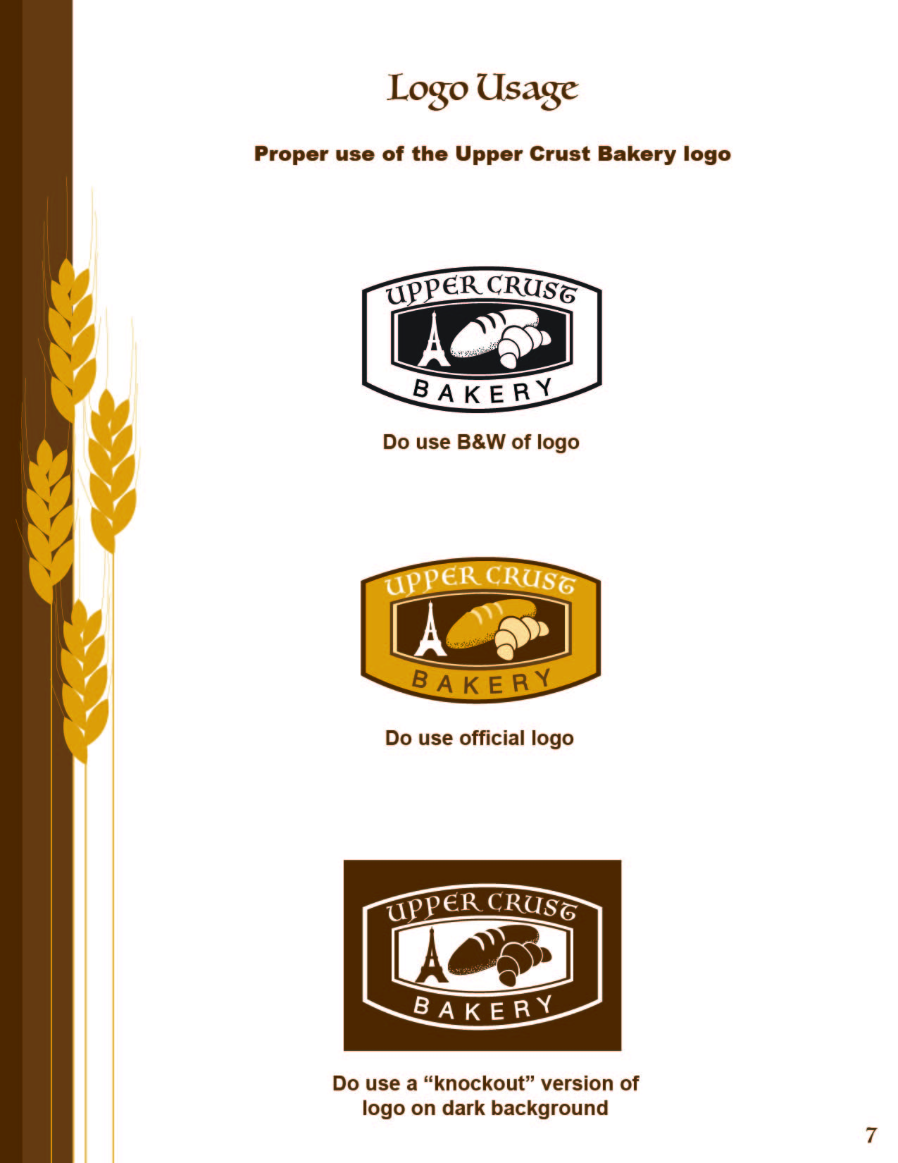
I used Illustrator to properly vectorize this logo becaue it's the best software for creating precise details using the Pen Tool. This logo design incorporates various elements such as texture (speckles of the bread), colors (white, light yellow, yellow, and brown), shapes (rectangles), and lines. I employed contrasting colors for all three versions of the logo: black and white, the official logo, and the "knockout" logo to ensure readability. I believe the heirarchy of this logo is well-balanced, creating a sense of unity. Additionally, it is suitable for printing purposes as it is a 300 dpi CMYK document.

This magazine cover features lines, rectangles, circles, contrasting colors (purple, white, and turquoise), and texture such as spa items like sponges, towels, palm trees, and more. I placed the couple image on top of it because I believe it is attractive to most people and it it could emphasize the desire for viewers to visit the resort & spa to relieve their work-related stress. I positioned the big Amethyst Bay logo in the center of the cover to ensure it is easily readable and it complements the overall design. People love discounts because they can afford it better than paying regular price. I believe that the combination of the phrases 'Enjoy. Relax. Rejuvenation.', exotic images, and discount information effectively captures viewers' attention, as many of them are drawn to these elements.
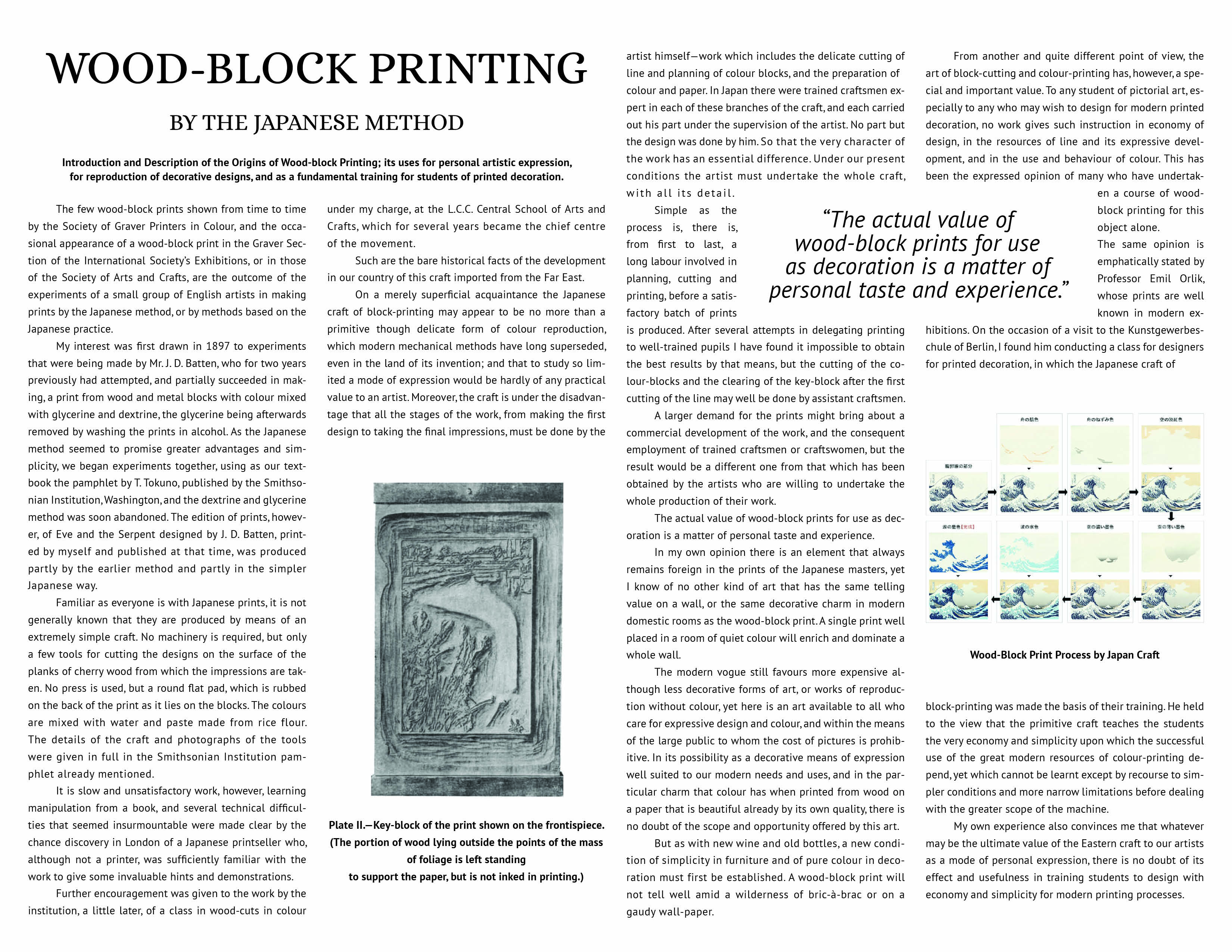
This software, InDesign, is the best option for creating a precisely gridded magazine spread. It's easy to use and allows me to seamlessly set up and arrange all the elements such as long text, images, quotes, titles, and captions to achieve an excellent overall look. I found it comfortable to work with as I was able to complete the entire magazine spread in just a few hours. For this specific page design, I utilized the Type Tool, Selection Tool, Properties for Character and Paragraph, two images, and Layers. For instance, I chose to justify the long text with the last line aligned to the left and adjusted the kerning or "Tracking (in thousandths of an em)" to 10 in order to optimize the text's fit within the magazine spread, while leaving enough space for the two images, captions, quotes, and the title. I can easily provide my design file to a client since I have already set up the Character and Paragraph properties to make it easy for her or him to modify and part(s) of the design. I determined that using a font size of 14 is suitable, with PT Sans as the sans-serif font and Alice as the serif font. Both fonts complement each other well in this design, and the Alice font particularly suits the wave image.
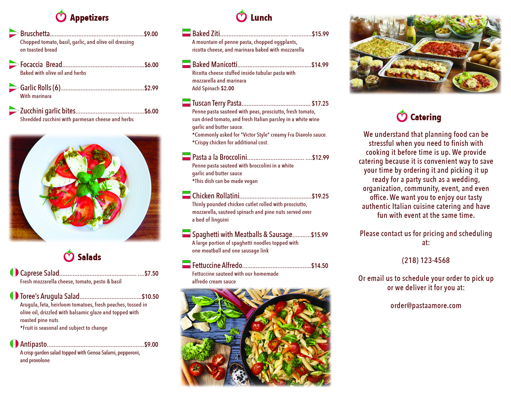
In Illustrator, I designed three motion icons using the Pen Tool, Selection Tool, Eclipse Tool, and occasionally the Direct Selection Tool. The motion icons I created, such as swirls, dot-bursts, and star-like shapes, are visually appealing and evoke the taste of delicious food. They are attractive and mouthwatering, making people crave them. To streamline my workflow, I utilized Character and Paragraph styles. As a professional graphic designer, these tools saved me a significant amount of time. They also ensured that all text appeared consistent and smooth throughout the design. I opted to use Illustrator to create the shapes of the Italian flag, motion icons, rectangles, and lines for this brochure menu. Illustrator's high resolution capabilities make it ideal for printing purposes. Considering this, I believe I executed these designs in appropriate ways for graphic design.
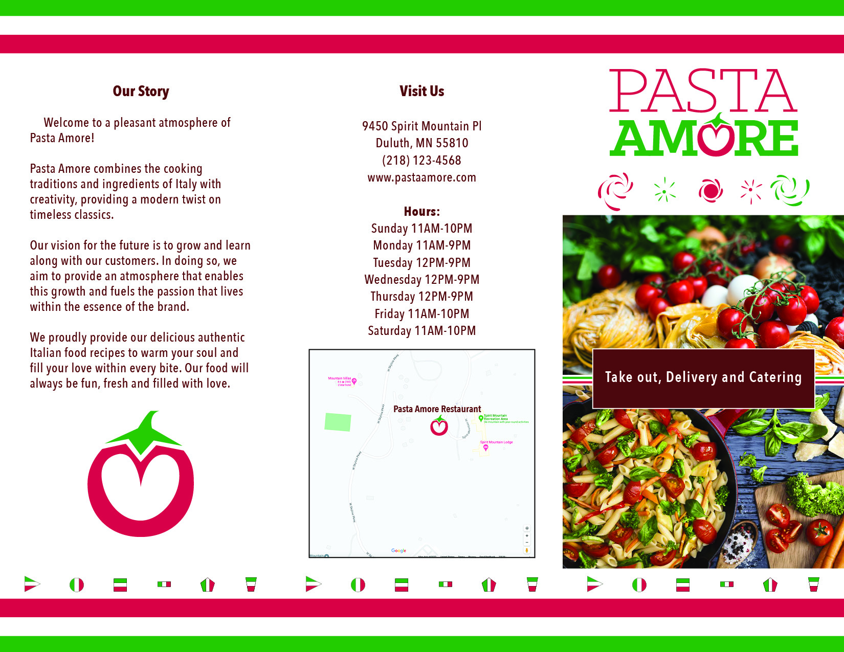
I incorporated recipes, various Italian shapes, Italian colors, adjusted images of Italian food recipes from Photoshop, and inspirational contents into this design. All these elements were placed on a simple white background to create an appealing look that draws attention. Additionally, I included different shapes of the Italian flag alongside the recipes to prevent the brochure from appearing plain on the white background. This design choice also makes it easier for readers to locate specific meals, whether it be lunch, dinner, or dessert. My intention was to make the Italian food images appear pleasant and dreamy, causing viewers to drool over them. By combining these elements and design techniques, I aimed to create a visually enticing brochure that captures the essence of Italian cuisine.
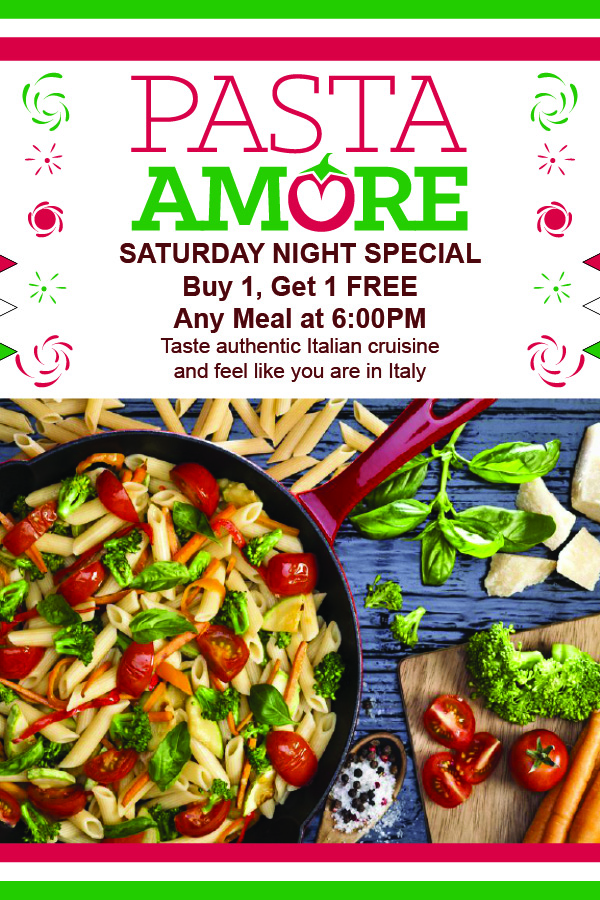
Having advanced knowledge of graphic design software and digial tools instills in me a great sense of confidence when designing various types of designs, without getting stuck. In my designs, I prioritize incorporating the elements and principles of design, effective content, images, and Italian brand identity. In today's modern era, both graphic designers and viewers prefer to see visually stunning and creatively designed materials such as logos, posters, magazines, and more. High resolution and superior quality are highly favored. I believe that such designs have the power to capture viewers' attention, prompting them to order delicious Italian food at a reasonable price. To achieve this, I use fresh colors such as red, green, and white to complement the Italian cuisine and reflect the Italian Identity.
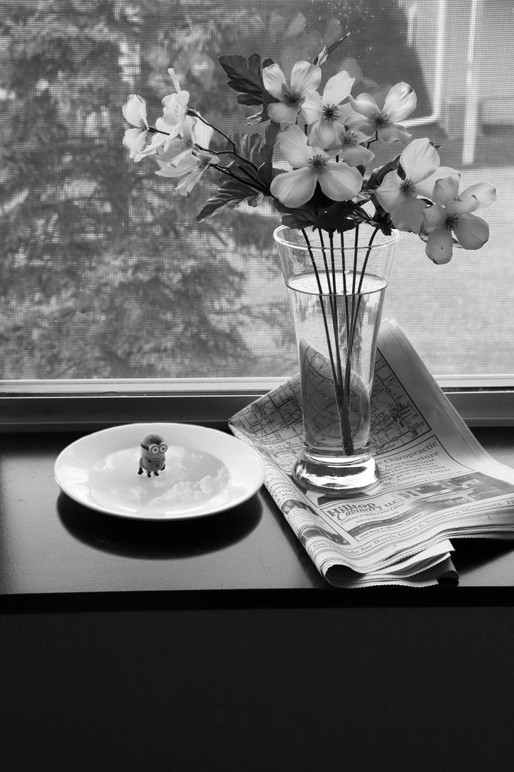
This b&w photo stands out because it lacks the clutter often found in a photo lab. For instance, I carefully followed a photographer, Josef Sudek's composition by locating the necessary items and setting them up to resemble his photo. This project served as a learning experience for my photography class. I combined several photos together, such as placing a minion on a saucer and blending it with a separate image of a clear glass adorned with white flowers on top of newspapers. Through this project, I showcased both my expertise and creativity. I believe that I excelled in this endeavor because the final result is sharp, visually pleasing with contrasting b&w tones, and incorporates elements and principles of design. It's my hope that viewers, employers, and clients will find this image appealing, and that those who have affinity for minions may also find it amusing.
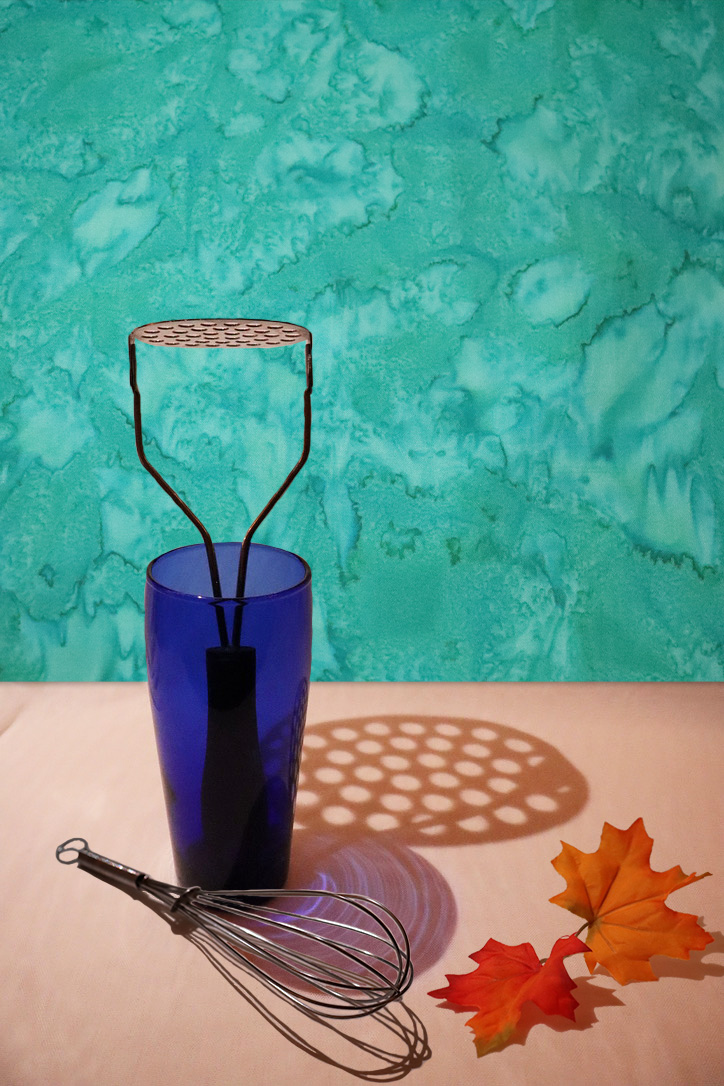
I felt like I made very little effort to complete this photo lab project because I already had ideas about how I wanted it to look for viewers to enjoy. My focus was on colors and selecting items to create a photo that would elicit awe or positive emotions like 'wow'. I followeed a similiar process as I did for the b&w photo lab, but this time I incorporated different items and used colors. In Photoshop, I combined photos of autumn leaves, a whisk, a blue glass with a potato smasher, and a turquoise background into one composition. I believe this photo is ethical as I don't see anything objectionable in it. This photo captures the play of light and shadows on kitchen items during the autumn season, emphasizing colors and more. As mentioned earlier, I went through the necessary steps to develop this visually pleasing and interesting photograph.
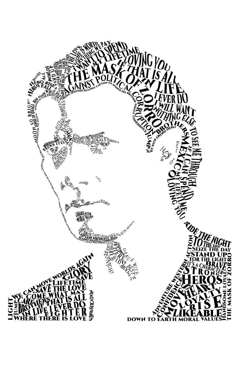
I chose Banderas as the inspiration for my design because I believe his character portrays positive traits in the real world. Additionally, his movie 'Mask of Zorro' features elements such as humor, entertainment, action, dance, costumes, and cultural aspects, which I find intriguing. I enjoyed arranging the text lines to follow the contours of Banderas's wavy hair, as I found it captivating. I consider this project to be ethical since I incorporated serious words like 'against political corruption' and other significant phrases from the movie and reputable online sources about 'Mask of Zorro'. I made sure to make 'The Mask of Zorro' larger and bolder so that it stands out as the movie title, easily catching the viewers' attention.
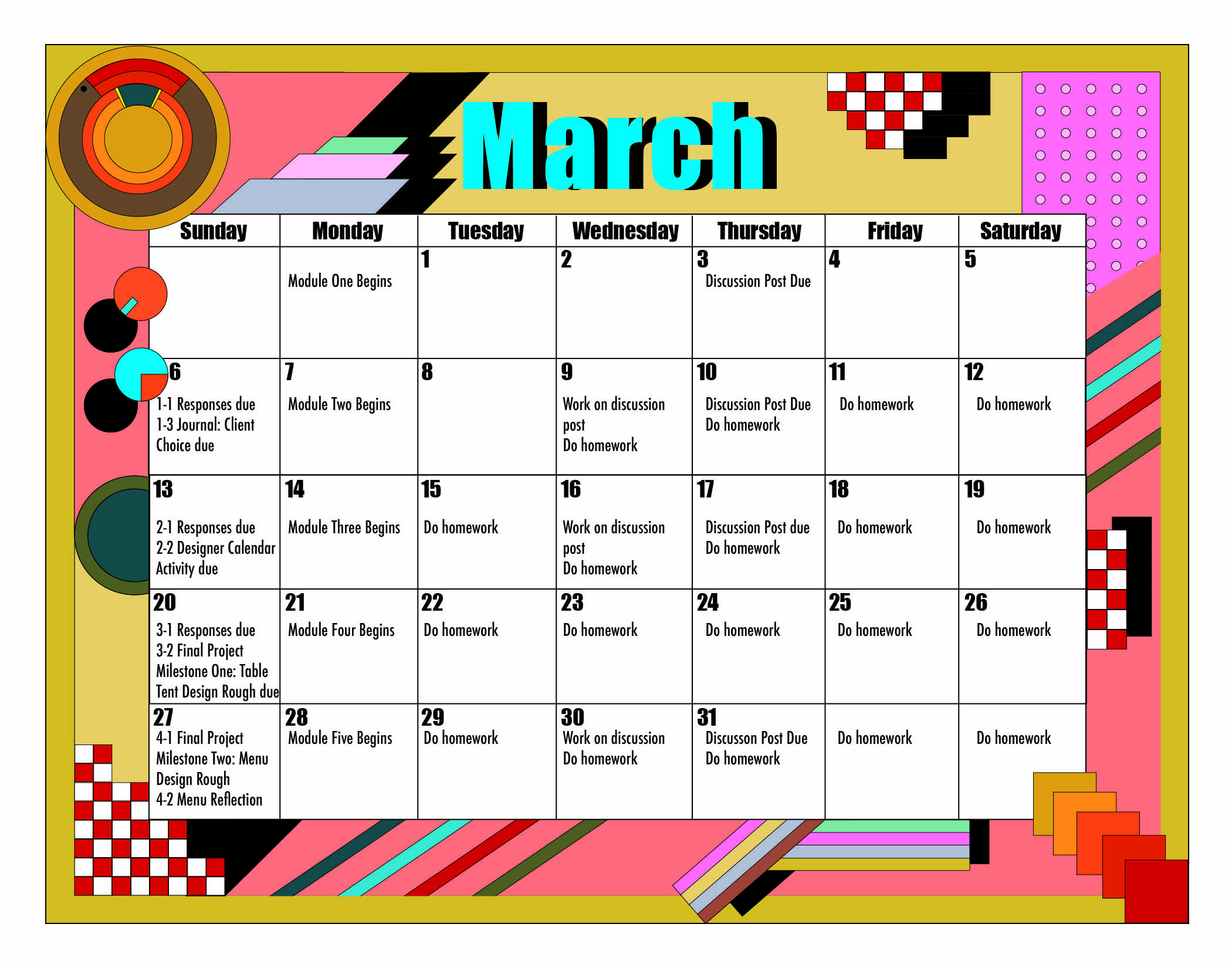
I decided to challenge myself by using digital tools in InDesign to create geometric shapes, without relying on Illustrator, as I had never done it before and I wanted to see if I could achieve satisfactory results. I utilized the Pen Tool to create lines and large triangles, the Eclipse Tool and Rectangle Tool for circles and squares, and the Type Tool for text. I worked appropriate techniques, such as creating shadows by copying, pasting, and adjusting the color to black, to give the illusion of shadows behind the colorful shapes. This showcases my advanced proficiency in graphic design software for my calender project. I believe I successfully accomplished my goal. For my calendar design, I drew inspiration from the renowned graphic designer, Milton Glaser, an influential figure from the 20th century. I conducted preliminary research on Glaser and his designs. I modeled my calendar after one of his notable designs, which incorporates red and white square shapes, circles, rectangles, and lines-elements that are synonymous with Glaser's unique style. His work truly ignited my creativity and served as a significant source of inspiration. Both my professor and classmates have expressed appreciation for my calendar design. It comes as no surprise that Glaser's design pieces are famous. I firmly believe that studying the graphic design works of well-known designers is essential for creating successful designs.
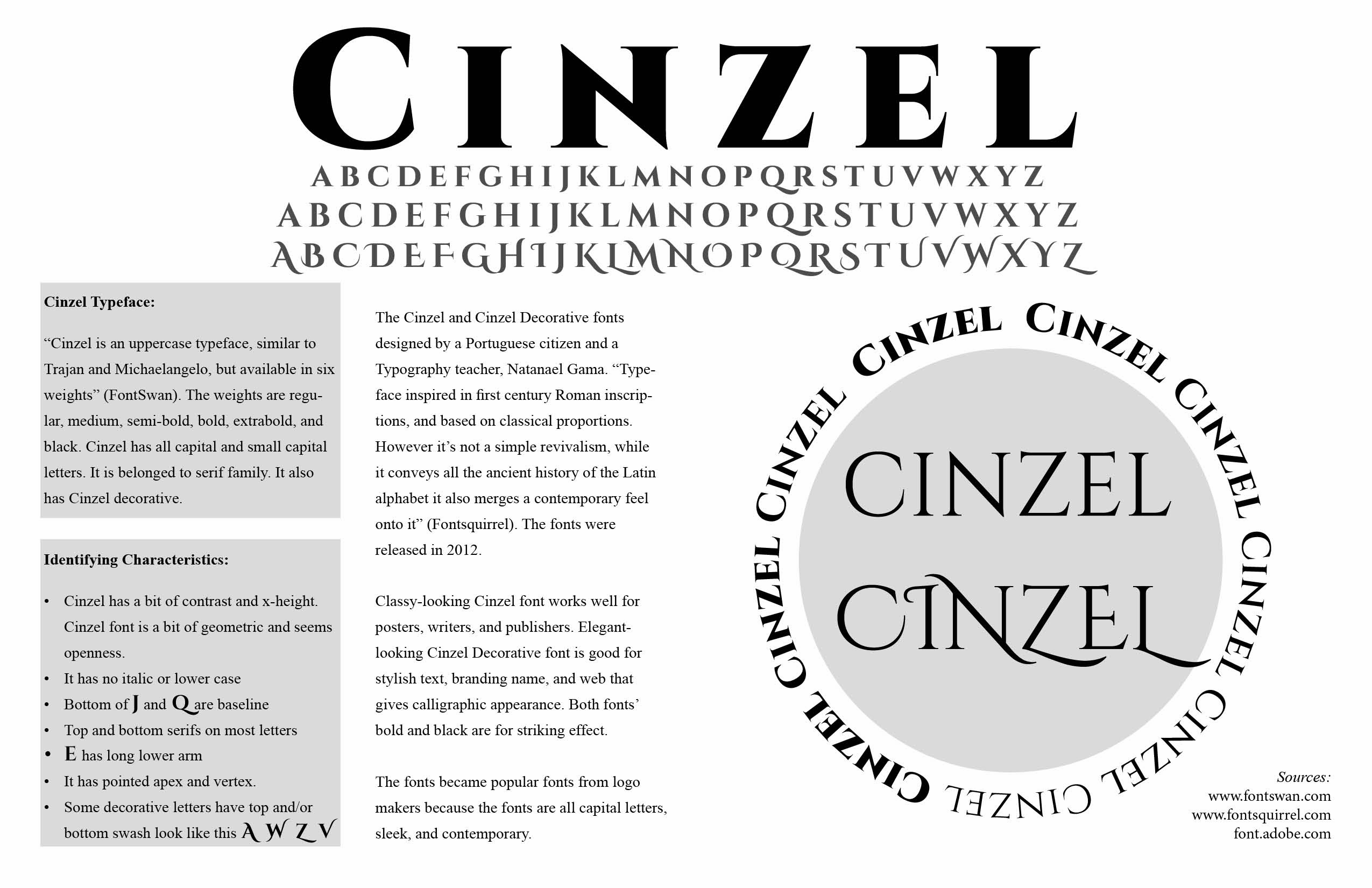
I designed a simple homage to font layout in InDesign using only the Shape Tool, Type Tool, and Columns for showcasing my chosen font, Cinzel, along with information text. I believe it was important for the design to be simple, as it allows for a clean and clear visual represtation, with the main focus being on the Cinzel font itself. A homage to font layout doesn't requre complicated text or design elements when the purpose is to provide information and examples about the font. To create a visually striking layout, I placed the black text "CINZEL CINZEL" on a light grey circle, surrounded by examples of the six weights of the Cinzel font. This arrangement ensures that the example stands out effectively. On the top of the layout, I featured the world "CINZEL" in a large and bold font, accompanyied by three lines of alphabets to demonstrate the appearance of the Cinzel font in different contexts. To maintain visual balance, I used grey for the alphabets, which complements both sides of the layout and enhances its overall aesthetic. Additionally, I incorporated two separate grey rectangles to clearly differentiate the sections that explain the "Cinzel Typeface" and its "Identifying Characteristics." This ensures that viewers can easily comprehend the information without any confusion.